ColorOS 7 Review: A fresh new look makes this one of the most compelling user interfaces
ColorOS is OPPO’s custom user interface on top of Android. At first, its functionality was tailored to users in China, which remains the company’s biggest market. Not unlike other user interfaces from Chinese OEMs, it borrowed inspiration from the design elements of iOS, while offering greater functionality than stock Android. However, OPPO’s expansion in international markets such as the Indian subcontinent, Southeast Asia, and Europe meant that ColorOS needed to evolve to keep up with the times. The iOS-inspired design elements were now a liability rather than an asset, as they conflicted with stock Android’s design language. To rectify this, OPPO released ColorOS 6, based on Android 9 Pie, in March this year. ColorOS 6 was a good improvement over previous versions, but it still had some functionality drawbacks and aesthetic issues that prevented it from being regarded as one of the better full-featured custom user interface.
OPPO, however, hasn’t given up on improving its software. Android 10 was released in September, and although OPPO wasn’t the quickest device manufacturer to roll out the update to its phones, the company offered a detailed roll-out schedule for the next version of its custom UI, which would be called ColorOS 7. At the end of October, OPPO started rolling out ColorOS 6.7 for the first-generation OPPO Reno. ColorOS 6.7 was very similar to ColorOS 7 (as they’re both Android 10-based), and it saw limited availability as it was only available for one phone. We did an in-depth review of ColorOS 6.7, which also functions as a review of ColorOS as a whole.
OPPO held a separate event for the international launch of ColorOS 7 on November 26 in New Delhi, India, after launching it for the Chinese market on November 20. The event’s location showed that OPPO was focusing on the Indian market, which is no surprise considering that India is the world’s second largest smartphone market. The ColorOS 7 upgrade adoption plan is said to be the largest update plan ever for ColorOS.
The ColorOS 7 update is now being rolled out as a trial version upgrade for users of the OPPO Reno 10x Zoom and OPPO Reno. Users of the OPPO Reno 2 will get the update before the end of the year (as will F11, F11 Pro, and F11 Pro Marvel’s Avengers Limited Edition, and other OPPO phones will receive it in batches. The full roll-out schedule can be read here.
Our ColorOS 6.7 review covers much of what is new in ColorOS 7, so readers are invited to check that out. This article will attempt to cover the ColorOS 7 functionality that was not covered in the older review, such as Smart Assistant, Doc Vault, the one-hand friendly modal UI, and new system sounds, wallpapers, and an all-new icon design. In essence, this review is an addendum. Without any further ado, let’s delve right into ColorOS 7.
About this review: This review was based on three weeks of usage of ColorOS 7 on the OPPO Reno 10x Zoom, which was loaned to XDA by OPPO.
The Good
- More minimalist UI
- Full support for Android’s notification features
- ColorOS 7 has a better dark mode implementation than Google’s stock Android
- Rich feature-set that can go head-to-head with top user Android custom interfaces
The Bad
- ColorOS 7 has a lot of bloatware, including region-specific bloatware for India
ColorOS 7 is based on Android 10
The latest version of OPPO’s user interface is, as expected, based on the latest version of Android 10. That means users will get all the expected Android 10 features: full-screen navigation gestures, dark mode, more granular permission management, and a mandatory Digital Wellbeing solution (in ColorOS 7, OPPO uses Google’s Digital Wellbeing implementation instead of developing a custom solution). Android 10 in itself is a solid upgrade over Android 9, and it’s good to see that every single flagship feature of it is retained in ColorOS 7.
ColorOS 7’s design is much improved from ColorOS 6.0


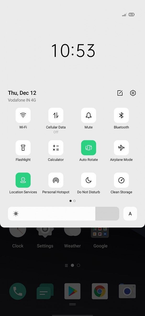
OPPO’s ColorOS 7 comes with a new user interface that is a breath of fresh air, as it doesn’t have the blur-focused user interface that so many China-based user interfaces have. Instead, its UI is starkly 2D, starkly minimalist. We went into greater detail in our ColorOS 6.7 review, but suffice it to say that this is not the ColorOS of old. Let’s take one example. The bright contrasting colors in the Control Center (quick settings menu) have vanished. OPPO now uses a single shade of green, and while it may sound insignificant, it makes a big difference when considering the fact that users make use of the Control Center multiple times everyday. Such examples of minimalism are found throughout the UI. The Recent Apps menu, the calling screen, and applications such as the dialer benefit from the lack of visual clutter.
ColorOS 7 has a brand new icon design, featuring rounded squares. The icons themselves are nicer-looking than the those of ColorOS 6.0, as the color scheme is more pleasing to the user’s eyes. OPPO says that the new icon design works with hundreds of third-party apps, ensuring visual consistency. In my usage, all of my third-party apps did adapt seamlessly to OPPO’s rounded square icon design.
The system comes with three new minimalist abstract wallpapers on top of the ColorOS 6 wallpaper collection. Additions include the Hawa Hamal live wallpaper, which is an example of a localized theme. The Artist Wallpaper Project helps users design wallpapers of their own.
ColorOS 7 brings an improved sound system including new ringtones, notification sounds, and alarm sounds. Again, this doesn’t sound a big improvement, but the new default notification sounds are quite good. It’s a small improvement that will be felt everyday, so it’s good to see OPPO nailing the basics.
One of the biggest improvements that ColorOS 7 brings is the modal page that helps one-handed usability of the UI. Samsung popularized this with One UI, and OPPO has now brought its own unique implementation. The toggles in the Control Center are placed lower, which is one thing. The modal page is used in system apps such as Clock, Contacts, and Messaging, and it’s placed on the lower half of the display. This proves beneficial when using phones with big displays, such as the OPPO Reno 10x Zoom, which has a 6.6-inch 19:5:9 display.
ColorOS 7 brings useful functionality on top of Android 10
ColorOS 7 is one of the most full-featured custom user interfaces out there. Its dark mode implementation is better than that of stock Android 10, as explained in our ColorOS 6.7 review. Dark mode in ColorOS 7 is adaptive, with support for hundreds of third-party apps, including the top 200 apps for users. The enhanced three-finger screenshot feature is another great example. Most custom user interfaces feature a gesture to take a screenshot by swiping down with three fingers, but ColorOS 7 lets users take a long screenshot or a short one by defining the screenshot area, which is not found in any other other custom user interface. Screenshots can also be edited instantly after taking them.


Features such as Riding Mode, Smart Assistant, and Doc Vault have been customized for international markets (once again, with a particular focus on India). Riding Mode is a specialized do-not-disturb mode for cyclists/motorcyclists, as it allows calls from only specified contacts and silences other notifications. Doc Vault, on the other hand, consists of a partnership of ColorOS with Indian digital document issuing platform DigitalLocker, which allows users to access digital versions of official documents and certificates straight from their phones. This can be used to speed up the ID verification process in places like airports or hotels, for example. It should be noted that we were unable to test out this feature, given that it is not present in the current ColorOS 7 trial version on the OPPO Reno 10x Zoom.
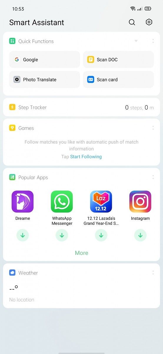
Smart Assistant is OPPO’s version of the customized left-hand panel on the home screen of the system launcher. OnePlus has its Shelf feature, while Xiaomi has App Vault. However, OPPO’s Smart Assistant is more feature-rich than its two competitors. OPPO describes it as a “handy information platform” that lets users view their step count, manage events, track packages, download popular apps, and more, all in a single place. Smart Assistant’s quick functions lets the user access Google Search, scan documents and cards, and translate text in photos. Users can follow matches in popular games, and popular apps can be downloaded. The weather information can be shown in the Smart Assistant, and users can also choose to enable a favorite contacts widget on the assistant for quick dialing.
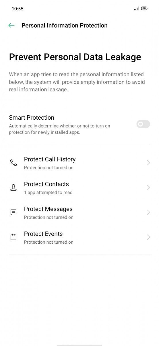
The privacy protection features that ColorOS offers is a significant differentiating factor for the custom UI. We have explained the innovative Personal Information Leakage Protection feature in detail in our ColorOS 6.7 review, and the feature won’t be found in any other custom UI for now, although it’s disabled by default. OPPO specifically promotes that unlike most custom user interfaces, ColorOS 7 allows users to decline an app permission requirement while still being able to use the app because of having the option to send blank contact information. The focus on privacy is welcome as ColorOS has 300 million active users according to OPPO. The OS does prioritize user privacy and security.
Private Safe is another example of a privacy-focused feature. It keeps important private files safe by transferring them to a storage folder, where they can’t be accessed, read, or modified by other applications. This requires a privacy protection password – pattern unlock is not eligible here.
 In terms of imaging additions, the camera app of ColorOS 7 is visually similar to that of ColorOS 6.0, but comes with functional improvements. Specifically, it has a new Ultra Night Mode. This does prove its worth in the OPPO Reno 10x Zoom by improving image quality to the point where the night mode is a serious competitor for Samsung’s night mode on the Samsung Galaxy S10, for example. Ultra Night Mode is said to optimize the clarity, brightness, and color of photos taken at night through multi-frame HDR and “smart AI algorithms”. The optimized post processing algorithm is also said to reduce image processing time, and therefore, photos in this mode can be generated in 2.5 seconds, improved from the 4-5 second wait time of the older night mode found in ColorOS 6.0.
Apart from this, we have AI Beautification 2.0 (that is thankfully disabled by default), smart AI noise cancellation, and the bokeh effect can now be applied in portraits as well as videos. Smart AI noise cancellation is able to repair pixel-level defects by anticipating noise points to make the sure the photos won’t be grainy and noisy, according to OPPO.
Finally, OPPO also includes its own video editor in ColorOS 7, named Soloop. This is a basic video editor that does the job for casual editing with respect to adding filters and effects, but advanced users will want to head to the Google Play Store and download a third-party app.
In terms of performance improvements, ColorOS 7 doesn’t leave users wanting more. Cache Preload is said to improve app cold starts by 25%. oSense, on the other hand, is said to be a scheduling mechanism that gives priority to front-end and user-related threads to optimize touch response and frame rates. Similarly, oMem is a priority management solution that allocates higher priority to the most frequently used apps. UFS+ is a System Anti-Aging solution, but further details were not given on how the feature works.
Game Space and Game Assistant are OPPO’s implementation of the gaming mode feature that has found its way in most custom user interfaces in 2019. Game Space enables users to manage and quick-launch games, while Game Assistant provides an autoplay feature and a customizable split screen mode. Do Not Disturb is included in Game Assistant, and users can choose to reject incoming calls as well. OPPO says that its oSense tech solution improves touch response by ~21% and frame rates by ~38%.
Conclusion
OPPO has gone from strength to strength in 2019. Its hardware this year has been defined by shark fin popup cameras, the innovative 5x optical zoom periscope camera module on the OPPO Reno 10x Zoom, 65W SuperVOOC 2.0 charging on the OPPO Reno Ace, and other futuristic features. We know that in Q1 2020, the company will announce the OPPO Find X2 with 5G support, the Qualcomm Snapdragon 865, a camera with an innovative autofocus solution, and more.
OPPO’s hardware has proved itself to be a differentiating factor; the software needed to keep up.
With ColorOS 7, OPPO has achieved that. Does it have annoyances and small usability issues? Yes, it does. On the other hand, however, it also has unique features that the competition doesn’t have an answer for, at least as of now. In its latest iteration, ColorOS is now an asset for OPPO phones, which can only be a good thing. We are excited to observe OPPO’s hardware and software development efforts in 2020.
We thank OPPO for sponsoring XDA. OPPO had minimal involvement in the creation of the content within this article. In particular, they were consulted for fact-checking. Any opinions expressed are those of the author. Our sponsors help us pay for the many costs associated with running XDA, including servers, developers, writers, and more. While you may see sponsored content alongside Portal content, all of it will be clearly labelled as such. The XDA Portal team will not compromise journalistic integrity by accepting money to write favorably about a company. Our opinion cannot be bought. Sponsored content, advertising, and the XDA Depot are managed by a separate team.
The post ColorOS 7 Review: A fresh new look makes this one of the most compelling user interfaces appeared first on xda-developers.
from xda-developers https://ift.tt/2PQbrKv
via IFTTT
 Reviewed by site
on
10:43
Rating:
No comments: