[Update 4: No Going Back] Android Auto is getting a big redesign with simplified controls and dark theme
Google’s I/O 2019 developer conference is officially kicking up tomorrow, but that doesn’t mean announcements aren’t already rolling in. While all of our eyes will be on Android Q and Google’s upcoming midrange smartphones, the Pixel 3a and the Pixel 3a XL, Google will also be taking some time to announce improvements/polishments to some of their current services, and maybe even announce some new services. One of the Google services that will be receiving a much-needed polishment is Android Auto, the automobile-focused interface of Android, which is receiving a facelift in an attempt to improve user experience.
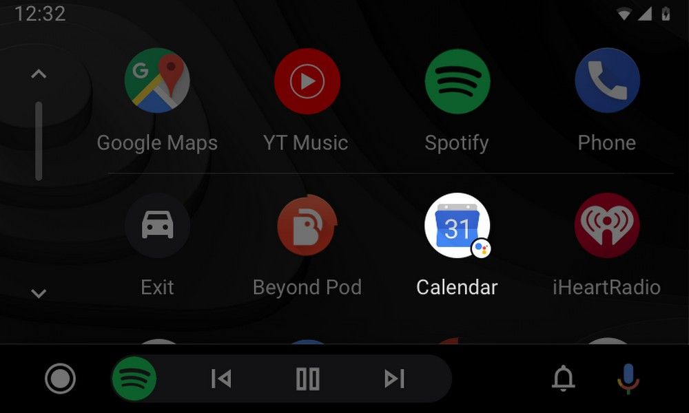
The new Android Auto interface is loosely based on Google’s new Material Theme guidelines rather than the older Material Design UI elements. With “loosely” being the keyword here: while design elements like outlined icons and Google’s Google Sans font are present in the redesigned Android Auto, they’re not as predominant as in other Google apps or the main Android interface. Instead, the new Android Auto redesign focuses on improving other elements, introducing things such as a reworked navigation bar, a dark theme to avoid eye strain on the road, a maximized display, a reworked notification center, and more.


The new Android Auto interface. Source: Google
The new navigation bar keeps things simple, showing contextual bubbles such as directions and music controls while you’re in other apps so you’re aware of everything at all times. It also brings a new, user-friendly app drawer more similar to what you’d find on your phone, and the new notification center shows all of your notifications at a glance. Everything is tied together under a dark theme, in line with Google’s new Material guidelines.
This redesigned Android Auto design won’t be immediately available, though. Google says you should be expecting this update to come to your car—or your phone, if you use it on your phone—sometime later this summer. Google I/O attendants will be able to try it out earlier, though.
Source: Google
Update 1: Rolling out
One Reddit user has reportedly received Android Auto’s big redesign. The new look, which includes a dark theme, appears to arrive via a server-side switch. Updating to the latest Android Auto APK doesn’t automatically bring the redesign. Let us know if you see the fresh look in your car!
Source: Reddit | Via: Android Police
Update 2: Not rolling out yet
A Google spokesperson told Android Police that: “The Android Auto update has not yet been rolled out to users.” The update is still on track to roll out sometime this Summer. It’s possible that the Reddit user was sent the update by mistake (which has been known to happen from time to time). No one else in the Reddit thread received the update. We will continue to patiently wait for the official roll out.
Update 3: Officially Rolling Out
Google has published a blog post to announce the roll-out of the Android Auto redesign. This was shown off back at Google I/O in May, but we’ve been waiting for the actual update to arrive. Earlier today, several users on Reddit started reporting that they received the redesign and now Google has confirmed it.
One of the features that wasn’t mentioned at Google I/O is Google Assistant badges. You’ll see these small Assistant icons on apps in the launcher. Tapping the icon will prompt Assistant to tell you about things related to that app, such as calendar events, weather, and reminders. Google says users will start to see the new design in the “next few weeks,” so stay tuned.
Source: Google
Thanks to XDA Member zimgir124 for the tip!
Update 4: No Going Back

Top toggle is now gone
The new Android Auto redesign is now enabled for all users. Google was allowing people to opt-in or revert the redesign within the Android Auto app by toggling “Try the new Android Auto.” However, the new look is now enabled by default and we can confirm that toggle is no longer available. For better or worse, this is now the permanent look of Android Auto.
The post [Update 4: No Going Back] Android Auto is getting a big redesign with simplified controls and dark theme appeared first on xda-developers.
from xda-developers https://ift.tt/317SaZk
via IFTTT

No comments: